Floating actions for dashboard panels
Problem
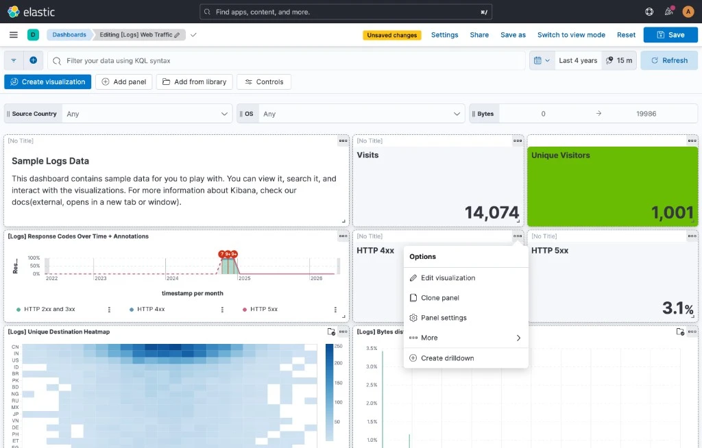
In edit mode, every Kibana dashboard panel had to show a title bar — even when the author hadn’t given the panel a title. The system needed something to anchor the drag handle, so untitled panels got a placeholder bar with grey “No title” text. It was the only way authors could grab and rearrange them.
The cost of that decision was a layout mismatch between the two modes dashboard authors care most about. In edit mode, every panel had a title bar; in view mode, the “No title” bars disappeared and the layout shifted. Authors were composing dashboards they couldn’t actually preview without constantly toggling modes, which is exactly the friction we wanted to remove. The dashboard editor wasn’t honest about what it was going to produce.
There was a second, quieter problem: panel actions were buried. Common things like edit, clone, and settings sat inside a kebab menu nested in the title bar — at least one extra click away, and discoverable only if you knew to look there.
Solution
The fix was to stop using the title bar as a piece of UI chrome and treat it as content again. To do that, the drag handle and the panel actions needed somewhere else to live — somewhere that didn’t take up vertical space when it wasn’t being used.
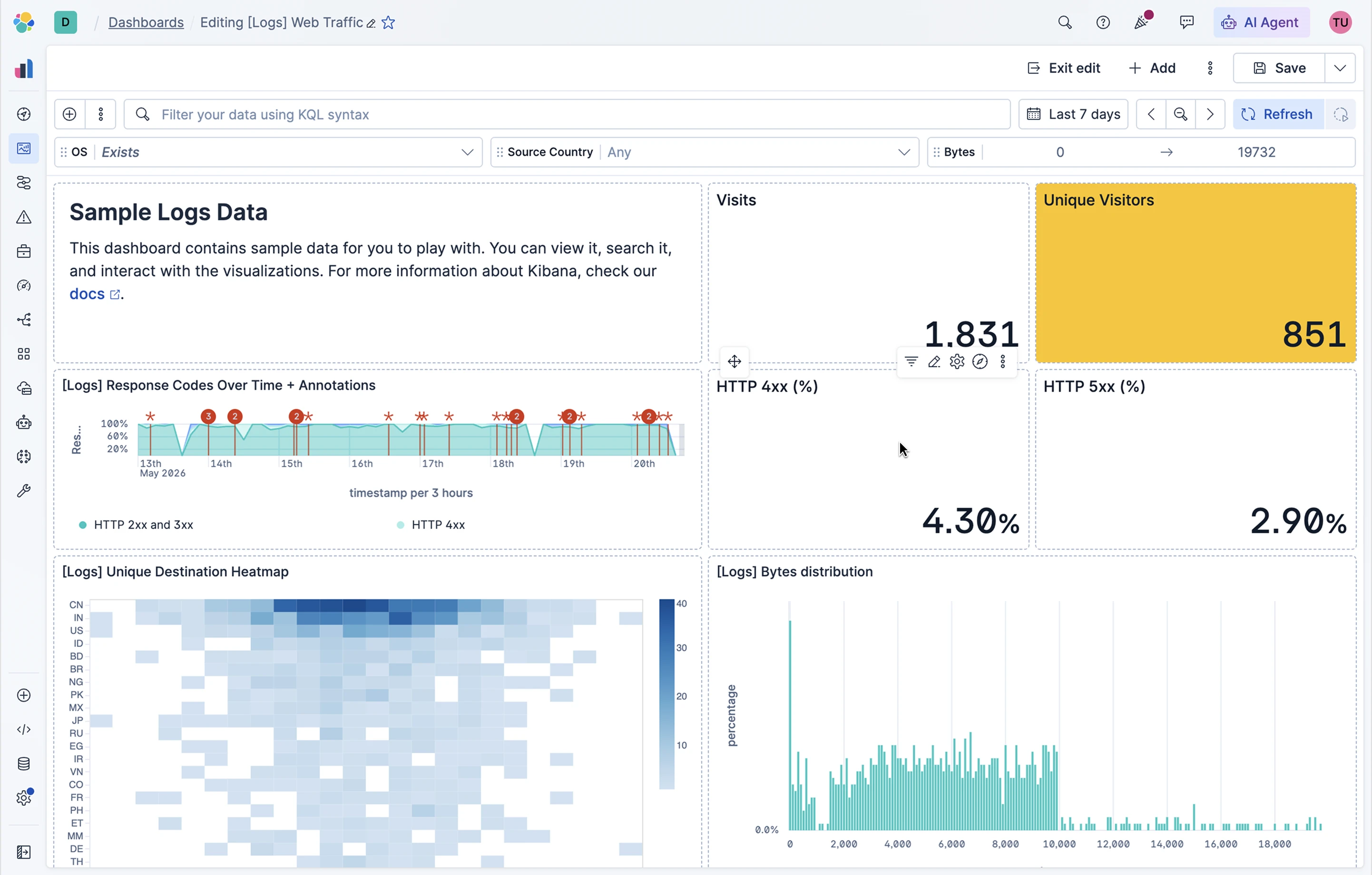
I introduced a framework for floating actions, drawing on a benchmark of how other tools handle per-object affordances. When an author hovers a panel, a small action bar appears with the most-used actions for that panel type, plus a dedicated drag handle and an overflow menu for everything else. The most-used actions are chosen per panel type based on telemetry from FullStory and our internal tools, so the surface is tuned to what people actually reach for.
Because the drag handle now has a dedicated home, the empty “No title” bar could go. Authors who do want to drag by the title still can — but untitled panels finally render the same in edit mode as they do in view mode.
Outcomes
The layout mismatch is gone. Authors compose dashboards in edit mode that look the same in view mode, which removes one of the most persistent points of friction in the dashboard editor. The most common actions are now one click closer for everyone, with the overflow menu still available for the long tail. And because the framework is generic, new panel types can plug in their own most-used actions without having to reinvent the surface.